In the neverending hunt for free commercial fonts for designers, I’ve often found myself turning to Adobe Behance time and again because of the quality and creativity on display among the myriad projects.
Behance is a fantastic resource for inspiration and discovery when it comes to design and creativity. For creatives, it’s a great way to put your work out there and, for clients, it’s the perfect place to browse and get a feel for the look of your next project.
There are a wealth of free commercial fonts for designers to be found on Behance but – as you’d expect – not all are free for commercial use; these are the projects of designers the world over and we’ve got to pay for coffee and pencils somehow!
It’s important to make sure you’re purchasing the correct licence when you use a font for a commercial project – the last thing you want to do is mistakenly download the personal use demo version and use it for your client’s advert.
Even if the font you’ve found IS available free for commercial use, consider making a donation; even a small amount of money and – perhaps more importantly – appreciation is very valuable to a jobbing designer.
With that in mind, I’ve checked that all the fonts listed below are free for both personal and commercial use (at the time of posting anyway). So let’s dive in and have look…
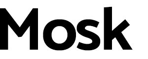
A bold and pleasing font, Mosk has a lot going for it across its multiple weights. However, it’s the subtly slanted end points and unexpected angles that lift this typeface into a realm where classic readability and modernity collide.
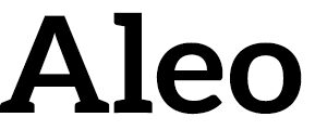
I’m a sucker for a slab serif and this one is one of the best I’ve seen. It exhibits all the impact and presence you’d expect from a slab but the light rounding off on the serifs softens the outline, allowing for greater versatility.
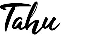
Even though so many are terrible to work with, sometimes you just need a hand drawn font. Injecting fluidity and movement into a design can be hard but the free form flow of an organic font can be the key. Tahu is one of my favourites in this category and, where so many do not, it remains fairly readable. It’s just lovely to look at…
OK this is a bit of a cheat… This family has 72 weights and only 4 of those are free to download but despite that the understated beauty of this typeface will have you reaching for the company credit card. Ranging from the precise yet defined hairline of the Ultra Light weight to the hulking power of Black Italic, the versatility of this font is incredible – making it an instant classic.
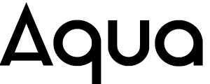
Aqua is almost two fonts rolled into one. The uppercase is strong and bold, reminiscent of Futura’s sharp angles and perfect circles. The lowercase echoes these fundamentals but becomes a pleasing series of orbs and lines that are soft as well as strong. The best aspect of this font is the marriage of structure and organic curves.
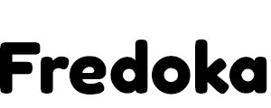
Not all display fonts need to be hard and angular; sometimes you just want a nice friendly typeface. Fredoka is warm and welcoming, yet strong and sturdy. You can make a bold statement without shouting.
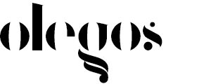
So far this list has been a bit functional… let’s get a bit weird with Olegos.
This minimalist, lowercase-only font won’t work for the majority of projects but it is a study in the use of negative space. The gaps in this typeface are filled in by your brain even when words become a series of subtly different lines. The tiny crossbars leave clues about ‘Fs’ and ‘Ts’. While you might never find a practical use for the font, just playing with it and admiring its elaborate descenders is fun in itself.
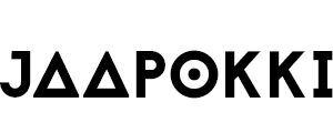
Jaapokki is the only evolving font I’ve ever seen. It comes with three ‘weights’: the first is a standard uppercase that shows off the font’s bold structure and modern styling. We then move into what the creator calls ‘Alternative Subtract’, where elements are removed; the ‘E’ loses its spine and the ‘B’ has its bottom corner bitten away, giving the font a space age ‘otherness’.
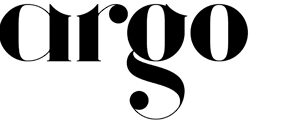
OK, I’m cheating again, but this beautiful Didonesque font is a mere $30 – a small price to pay for such opulent precision. Argo has been specifically designed to interlock and combine with itself through carefully placed scallops and grooves. As it locks into place there is a feeling of completeness, like fitting puzzle pieces together.
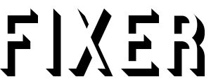
Fixer cleverly uses different weights to provide differing styles of lettering like inline, shadowed and display (an inlined outline). The result is a versatile font that offers applications you might never have considered. The unfussiness of the lines hide these quirky options and can really create a sense of interest in a piece of work.
• • •
If you don’t regularly use Behance for fonts, perhaps this will inspire you to check it out. The volume of quality work on there, not to mention the countless portfolios of excellent design and art, guarantee you’ll find something to inspire, use or simply just enjoy.
Happy font hunting!
Whitewall Marketing are a digital agency in Glasgow. We help you find free commercial fonts for designers to use on their next project. If you’re looking for free commercial fonts for designers then check out our guide on our website. Whether it’s for print, digital or advertisements, the range of free commercial fonts for designers is endless. Check out our guide for free commercial fonts for designers today.